IA EXPLORATION :
ALEXANDER STREET
" we love bringing otherwise “silent” and hidden gems to scholars and students. "

Project Brief:
This project was being created during the Information Architecture & Interaction Design class taught by Sandra Davila. In this courses I cooperate with my classmate. We analyze the user journey, conduct user researches included task observation, interview, and card-sorting activity. After collected the data, we came from ideas and measured our idea. We created the wireframe of specific function and prototyped it.
Introduction:
Alexander Street is an online platform that provides scholars and explorers precious content for further researching and learning. All of the content in Alexander Street is created in the highest academic standard. Alexander Street is especially strong in the fields of counseling, anthropology, history, diversity studies, theatre, film, music, dance, news, current affairs, and the social sciences. Thousands of streaming audios and videos, pages and documents are being shared with the users.
The purpose of the project is to increase access to Alexander Street's special and exclusive collections. I worked with my team members and created prototypes and wire-frames based on the purpose.
These contents are shown in the original site
as aside:

My Amazing Team Members


Nayana Malhotra
Tiehan Zhang

Mia(Shuchao) Song

WenLin Pan
Observation Tasks Design /Interview Design/ User Journey
Card-sorting data analyzing/Wireframe Idea / Web-based wireframe
Usability Evaluation/ Tech Advisor
Identify the Users & Websites
Knowing the Users : Interviews & Observations
Since we are not expert of video streaming, the first step of the project was to interview people to understand the nature of the interaction between users and online video platform.
Such as :
-
How much information and structure a user had before they started
-
Whether they went deep or broad
-
Use of keywords, filters & categories
-
Where in a user’s overall research process they approached the website
After briefly discussed about what do we want to know, members of the team conducted 8 interviews and came back to shared our findings. We also designed a set of tasks to observe how users make commitment to select a video based on subjects in both casual and academic requirement. We asked 6 users to find 3~5 videos which could illustrate the topic we assigned (for academic requirement) and the topic they select from a list (for casual subject). In the observation we asked our participants to think out load, which helped us understand their strategies and thoughts.


We wrote down our finding to keep track of the ideas and group them together to merge our thoughts.
The findings were translated into elements which help us create persona of the users and develop our initial insights of designs, which are :
-
Users are less trusting - They prefer to seek personal recommendations over algorithmic suggestions
-
Users don’t want to feel dumb - Encountering unfamiliar jargon is off-putting and intimidating. Users want to feel like they are being as efficient as possible, both in terms of information and search efficiency
-
User's History - User’s previous habits influence their expectations- they seek out familiar experiences and carry over behaviors into subsequent environments
Interaction: Persona & User Flow
 |  |  |
|---|
We putted together the result of observations and interviews to create 3 personas.
The persona is an efficient tool which could help us evaluate the interaction between interfaces and the users. We created a user flow of LINA, describing her thought and her actions while searching for some materials for her semester project:

With these elements, we started to brainstorm functions that might improve their user experience. We drew sketches to communicate the ideas, and rate them together by user impact and technical feasibility. Imagination was wild, but we evaluated them carefully.


The functions are measured by user impact and technical feasibility. We evaluate each function separately and discussed our decisions.
After the evaluation, the team Mochithing started to dig into the information architecture of Alexander Street, in purpose to get clearer insights on the service.

Information Architecture Analysis : User's Vision
To further explore how would the users comprehend and interact with the information located in Alexander Street, we started to practice card sorts. Participants were being asked to categorized cards ( which we created a series of items by altering video titles and subjects) and explained their categorizing strategies.
After conducting several cart sorts, we found that some participants rather to group some subjects use high-level strategies (by uses, by issues ...etc) than simply categorize them with academical disciplines.


Even though most of the participants did create similar categories that Alexander Street uses to categorize their featured media (which is nice, meaning that users might be able to find things they want to find with intuition) There are some subjects which are more special than others. For example, for many participants, "war" is very different from "part of history."
The result of the cart-sorting posed strong influences on the project, the members of the team carried these findings, and move on to the next step: To define our target of development.
The card-sorting test has totally changed our design plan since we understood there are users who use specific strategies and points of view to understand Videos. We came back to our competitor analysis and ideas, setting a new focus for our project.
Goal : Reset
After understand that most of the users can successfully use the original "Discipline" menu to get to the theme they want, we started to view our challenge in the other direction: how to navigate users to cross-discipline collections which they might be interested in? To fulfill this requirement, we got inspiration from Ikea, as it allows the user to find items based on their real requirements.


After creating the mock-up, we also decided to redesign the whole "categorized by" section because the current design seems to be a little messy and confusing. We looked back at our brain-storming functions. This time, different function stood out and became the base of our final design.

Our Design
First Wireframe

The first design was based on this sitemap. After a few very simple user tests, we learned that :
-
There were too many layers in one navigation.
-
“Special Collections” was buried too deep within the main Browse By menu.
-
The user felt confused about the "View all" link at the end of the Browse By menu.
To fix these issues, we separated the special collections as an individual page, which allows users to enter special collections owned by the website.


Move on, Get Better

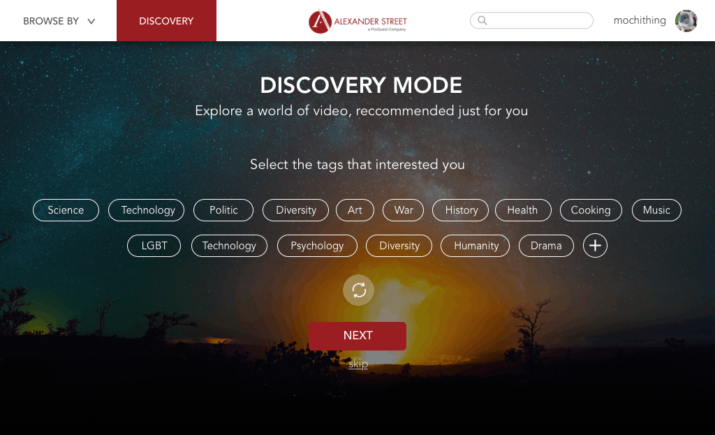
The whole wire-frame includes 3 entries of collections: one in the navigation button "BROWSE BY", one at the landing page with instruction, and one through the "Discovery" function. In the Discovery Function, users select tags to define their journey. If the tag they want to add is not showing on the page, they add the tag by simply typing the word.
To evaluate our design, we created a test that includes 3 main tasks: To describe the expectation of the function, to navigate through the menu, and to operate the "INSPIRATION" function. 8 users are being invited to test our design. The user tests brought us issues that we didn't identify in our own designing process. By importing these new findings, we modify our design concept.


Before
After
On the home page, we add explanation on "Special Collection" so that users would be able to learn about special collections on Alexander Street.

Before

After
At the EXPLORE function, we found that fewer users tried to interact with "Add Tags", so we minimized it.
We also learned that users want to use the refresh button to receive new random tags to set their own interests.
We also use the word DISCOVERY to replace EXPLORE, since the users mentioned that is more familiar.

Before

After
After setting the tags, users would be led to an inspiration page. While we asked users how do they feel about the outcome of their DISCOVERY decisions, they mentioned that they want more information about the result. The filters on the left bar are too distracting. Also, they said they want more control on this page.
As a solution, we added more information and designed a way for users to interact with the folded filters and the tags.
High-fidelity Prototype
To illustrate the project, we also created a high-fidelity prototype of the DISCOVERY function since it's a brand new function in the website service.

navigation of the DISCOVERY function
Add a new tag by hand
Conclusion:
The project is looking forward to developing functions to allow more user interaction. By enhancing the accessibility of the collections, the users would gain more opportunities to learn, to explore, to conduct researches on Alexander Street's amazing video/audio/documents collections. In addition to what we've done, ee would also suggest creating consistency between collection pages so that the users would understand they are still at the same level/kind of contents.
While we learned a lot from our user tests in the wireframes building process, we would want to test our final design to create a better user experience. Also, we were not able to test our mobile wireframe. If given more time, we'd conduct tests on the mobile version because based on our user research people tend to use mobile devices to watch and search for short videos.

REFLECTION
This is a project which featured a very complete user research. We started from observation and interview to discover our user, using systematical techniques to explore the information architecture of the website. Since teams in the class were all working on different functions on the same website, we also learned a lot from other teams' research. While we created our designs, we have many "experts" who understood the website pretty well to give us advice. It's a unique experience working with a small team and a big team simultaneously: We learned from other people's design, trying to create consistency while working separately.
In the course, we learned specific techniques in a fixed sequel. Sometimes these methods are not necessarily being the best way to collect the information we needed at the moment. It's also a nice opportunity to practice how to utilize the information we collected. Or, not to. We were surprised and excited while our card-sorting result turned out changed our whole design plan. It's an amazing feeling being driven by user research.