


Cuisino!
Meal Plan Digital Product Design
You can also see the project here:
https://www.natsume.design/project/cuisino/
First, what's Cuisno! for?

Picture this: You sit at your office, trying to read the long, long list of the restaurants provided by the delivery app. There are thousands of choices. You would need forever to read them all. Clock ticking, There is the dilemma between order the same thing you ordered before and/or get annoyed by routine or order too late and starve.
It's an annoying decision, isn't it? There are already too many decisions for us to make in our life, our works, our dating choices... our web design tasks...
In the big cites, decide on food is usually more complicated than getting them. The wide varieties and limited time easily confuse the consumers, leads to unwilling choices. According to our research, many young professionals suffer these daily choices at different levels. If you are one of these people, here's good news for you! Try Cuisino!
Cuisino! is a digital product designed to solve the decidophobia on meal decisions. Our target audiences are young professionals who live in bigger cities. The product features user-friendly and playful UI to communicate with the users, provide dish ideas, and helps the user make decisions by allowing the users to throw back the question to the system: Play a game such as paper-scissor-stone or lottery, same as how people do in their real life.
Second, who and why they designed?
My Role and My team:

This was a project in collaboration with Yi Chen and Wei Wang. You can visit their Linkedin by clicking their names. And me? I'm always here. You can also visit my Linkedin for further information. We also got a lot of help from our teachers:Carolyn Li-Madeo and Prof. Craig MacDonald
I was the UX/UI Designer for this project. However, it's more a "we" project.
We conducted user research, competitive analysis, created personas, user stories, workflow, UI sketches, wireframes, and UI design, and prototypes of a mobile app. I was more on flow and AI structure, the functions, the elements, the games. Yi and Wei helped more with visual and graphic designs. However, we almost designed everything and made every decision together. Due to the COVID-19 crisis, we also met on Animal Crossing.
BTW we DID have plans on our schedule...

It is a little difficult to write down what happened after the lockdown. Thankfully we cooperated and supported each others and successfully handed out what we planned to hand out at the end of the design timeline.

Before jumping to the design,
Our researches & Thoughs
User Research:
For user research, we interviewed 10 up target audiences about their general eating behavior to understand how and why they make their decisions, and what feelings do these decisions bring to them.
In the interviews with these urban new generation people, we discovered a variety of lifestyles. Some cook in advance, some order delivery, some tend to get food from restaurants nearby or on the way to their office or home. However, they all suffered from making a decision: LUNCH CHOICE.


After we discussed the result of the interview, we started to build up the persona. We ended up coming out with 3 personas: Workaholic, Life Enjoyer, and Health Engager.
We compared these personas, put them on scales, and decided to focus on 2 personas: Workaholic and Life Enjoyer.
While our personas are different on their priorities, they are both working long hours and would need to take care of themselves to keep themselves being productive and do not cook often. Based on their personality characters, we created user journeys on their general daily lunch challenge.

Let me introduce Charlotte the Life Enjoyer and Dwight the Workaholic ‘s normal lunch routine to you.
Charlotte, a person who highly interested in food and life, gets excited while the idea "lunch time" comes to her. However, she feels stressed right after she comes out with many ideas -- get ready with every opinion she can think of waste too much time in her precious working hour. Now she only has a short period to consider all the attributes: budget, nutrition, everything.
Our Life Enjoyer meets a dramatic landscape emotion while making her decision, and ends up choosing the safest option she got used to for a while. The choice does not correspond to her goal: get something interesting to cheer her up.

At the same time,Dwight gets annoyed by the truth that he has to stop working on his tasks to order something to keep himself being energetic. He has few thoughts about what to eat and wants to choose a random thing he has had. However, a voice in his head tells him that he should not eat junks.
Dwight opens an app on his phone, browsing the lists of restaurants mindlessly. He does not know a lot about the restaurants, so he picks a random one. He reads the menu. It looks like the healthiest thing on the menu is a salad, at least among his knowledge. He orders the salad from the restaurant and happily goes back to his works.

In comparison to the Life Enjoyer, the Workaholic shows less significant emotional changes. However, the whole experience generally negative. And, most importantly, their Jobs To Be Done can be satisfied by one single product. Guess what? We were going to work on it.
After constructed the journey maps, we clarified our design goals:
-
Help users come out with ideas of dishes, instead of letting them start from the restaurants
-
Help users make a decision between options
-
Let users keep track of what they have had before so that they won't have the same food forever.
Competitor Analysis:
To identify the competitive environment, the priority, and to get inspirations on our goals, we conducted a review of many competitors of different features that each corresponds to 1 or 2 functions similar to our early-phase idealizations. Here are 4 examples:

These products are working well to serve the users' needs, but none of them provide functions helping users make the decision between options. None of them recommend dishes -- which seems to be common sense that people think of food before trying to find a restaurant for that kind of food. Also, for the nutrition recording and tracking, we think it's benefitial to combine the features and provide awards to encourage the users with high usage.
After all, what would be
SIGNIFICANT about
our product?

-
Quick, quick, and quicker decision.
-
Simple, thoughtful customization setting.
-
Gamification and fun experience building.
How did we bring ideas to life:
Our Design & Prototype

Designed with Adobe Xd
Sitemap:
We created a sitemap ( product map) of our product, clarified all the functions which merged our brainstormed ideas. We added more detail on the functions we wanted to focus on: List & Shell and Omakase. These 2 lows describe how users get random results and what information should be put on the page to help them going through the process.

Wireframes & Drafts:
Since we wanted to do something creative, we had more than many discarded screens. Here I would show a small parts of our struggle. We used the same file to create the wireframes and the main prototypes, so some of the wireframes were being transfered into prototype frames.

I would introduce how some of our ideas being translated into real function before pasting the prototype link.
Ideas:
Active Navigation Bar
To provide a more creative experience and enable more direct functions, we want to propose an untraditional navbar.
We'd given up about the navbar in the early phase of wireframe design because it's too difficult to manage the layout. However, the idea became more and more favorable in our later stage -- after we settled down on the function, we started to develop it again. Eventually, we designed this playful navbar for our product.


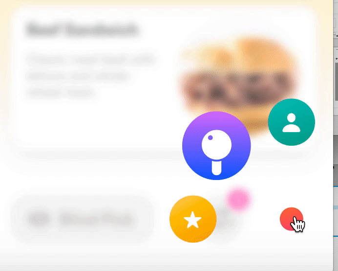
Dish List
One of our primary purpose (also, the significant difference with our competitors we want to accent on) of this product is "Start from dishes than restaurants." This idea development was focused on at what level we should detail the info-card and at what level we should give freedom to the users hanging around the recommendation list.
There are many psychological pieces of research about the relationship between choices number and the difficulty. At the end of the day, we settled down on 3 cards and giving shuffle options. We also made efforts on providing the best previewing experience. Color, Illustration or photo, layout...
Also, for those who are not able to decide between 3 choices, we designed the shell-game function -- which we called it "Blink pick" in later phases of our process.


Omakase (cuisino)
Omakase! is probably the most complicated and the simplest part of this design. The flow of the function is extremely straight forward, so we had to work on the interaction design to make the flow both informative and exciting.
The concept of this idea is the feeling of "unknown." Open the cover on the plate to see what's under it; Ask a waiter what today's chef special is; Surprised gift in the wrapping paper; Lottery.
This function is also the reason we called this product Cuisino. The art style and the experience of the flow are, without exaggeration, as crucial as the product image.
The function was called "Omakase!" in the earlier development process. Omakase is a Japanese phrase that means "leave it up to you", gourmets use this phrase to leave the decisions up to the chef. We created several versions of this function -- We drew patterns of the UI using the image of gatcha machine, card game, arcade... many ideas are charming, and we kept the possibility to let the product includes more than one pattern of this "cuisino!" function. It can be the reward of being an active user, or as the setting of seasonal events. For the prototype, we used the ticket machine to illustrate the idea.


Finally, the prototype:
Onboarding & Preference
The first section of the prototype is the onboarding and preference setting section. We kept the core value "the user wants to make quick decisions" in mind while designed all these screens. Though we hadn't created wireframes of the Diet Journey part so far, we can design the introduction of the function with our clear flow map.
The preference setting can be very beneficial to the users since it can help them avoid allergic or hateful ingredients in advance. Since our recommendation is about dishes but restaurants, it's easier to do this. The budget is also one of the important elements in the decision-making process. It's also easier to filter out expensive or over-cheap dishes by dishes.

Dishes! Games ! Let's eat!
After setting the preference ( or after the user skips it ), the dishes list immediately provide 3 choices. 3 is the best number we found for this screen. The users can choose any of the cards if they find themselves feel like any of the dishes at first glance. Or they can use the button to shuffle the cards out. After all, saying "I don't want this" is much easier than "I want to have this for lunch."
If the 3 choices are all acceptable to the users, they can use the blind pick button to trigger the card game. Though it's a random process, we leave the "picking" action to the users to build experience of control. Whether they like the final result of not, they would be able to conceive about what they want while the card being revealing. This is also corresponding to the theory "You'll know your choice while flipping the coin."

Cuisino!
The ultimate solution of those who have "decidophobia" or just simply don't want to waste their valuable cognitive resources is Cuisino. As the introduction of the idea in the last part, we accented the feeling of playfulness and surprise.
It's a straightforward interaction. The users pull down the handle, and the wheel would start to roll. After it rolls enough a card would be printed from the machine. Then they can use the card as a ticket to order something delicious.
The concept of this ticket-printing animation is also related to the function we had not put in the prototype so far -- the journey. In our plan, the user would be able to create their meal diary by taking a photo of their meal and turn it into the card collection to keep track of their eating behavior and winning benefits as the reward of being an active user.

The primary reason I kept using Adobe Xd is, it generated an interactive prototype on its own. Below is the prototype which shows the design of this project. Of course,there are more functions we wanted to add on later, but the main function had been developed.
REFLECTION
The project was the first original project I've participated in. I am delighted that I found team members who support making something creative and playful. We spent lots of time discussing ideas and flows and our goals. Having a research plan is very helpful during the project. We almost got lost several times during the flow design process. However, the research plan can always bring us back to the right track since nothing is conflicted while we had a consensus on our REAL goal.
Both of my teammates have graphic design backgrounds. I learned a lot from them through a the project, and I hope they felt the same as me.
Overrall, it was a pleasant experience for me. Managing to reach and even surpass the goal in the COVID-19 influence was constructive for both my mental and professionality development.