Simple is the Best : CHB redesign
User flow and mobile interaction
BACKGROUND

Chung Hwa Bank is a Taiwan-based financial institution that offers both retail and commercial banking services to private and corporate customers. It has 7 oversea branches and more than 170 domestic branches. The CHB mobile bank app enables customers to get access to the services.
As I am one of the customers who had benefited from the services, I choose the app as the topic of my school project. I analyzed the app structure and the needs of bank apps in Taiwan with a survey and attempted redesigning the app.
Functional Redundancy
Through the survey, I learned that even most of the bank apps in Taiwan provide a broad range of functions, not every user uses them. In fact, Less than 10% of users interact with these functions.
Since there are a large number of complaints about findability issues in this survey, I started to think about the relationship between redundant functions and user needs.

RESEARCH
General Experience
In purpose to understand users' thoughts, I conducted a survey asking users about their behaviors and feelings while using online banking apps in Taiwan. 161 people participated in the survey, most of them are people around 20~30. They are people who feel safe using online banking systems to deal with money. However, 69 of 161 participants talked about bad experiences with the apps they used.
IDEAS

After analyzing the data and talking to some participants, I decided to simplify the CHB app. I targeted users who do not use their app to investigate funds and stocks but only use the app as a mobile ATM for their daily life usage, including account balance viewing, transferring and bill payments.
DESIGN STORY
BEGINNING:
One of the biggest challenges in this project is to understand the structure of the functions. For example, what information is needed to process a transfer? How do people understand transfer and bill payment? What services can the bank app provide?
I did some researches on the rules and the mechanisms and came out with the flow of the main functions I selected to design: transfer(wire) and bill payment.
CURRENT PRODUCT ANALYSIS:
To get a solid idea on small amount transfer (wire) and bill payment, I analyzed the design of Paypal and Venmo carefully to build up a process that the users might already get used to. Both of them have nice, thoughtful design.


ELEMENTS:
In comparison to Venmo and PayPal, The original CHB app contains warmer colors -- which are also the image color of the bank. To keep this consistency and use this advantage to gain recognization and findability, I decided to keep this color palette.
Considering this version of CHB apps are designed for people's daily usage, I realized that this app can be more playful. Since the bank use "Shiba the CHB" to promote their business, I designed several icons based on "Shiba the CHB" to provide a delightful user experience.

DESIGN & ITERATION
WIREFRAME

These flows are designed for 2 user scripts:
a) Users use the app to wire money to someone who has filed in the app.
b) Users pay their bills with the app.
There are also some flows not in the chart:
c) Users file account information of the new payee.
d) Users check account balance during/after the transaction.
e) Users review recent account activities.

Since this is an individual project, user testing is more than essential. I took user tests with 3 users remotely. The users were asked to look at the screens and interact with them.
Through the users' feedback, I realized that even my purpose of the project is to simplify the app, I still made it too complicated. I looked at my wireframe and started to delete elements on my interface. I showed my users my design again and again until we agreed on the flow.
"If I want to do something complicated and unsure, I'd like to go to physical branches and ask for help." One of my users said. "Some apps ask me if I want to send an email to my payee and ask for an email address, I'd rather take a screenshot and do it myself. I don't need that function. It bothered me."
USER TEST: ITERATIONS

Support by Adobe
PROTOTYPE
LOGIN SCREEN
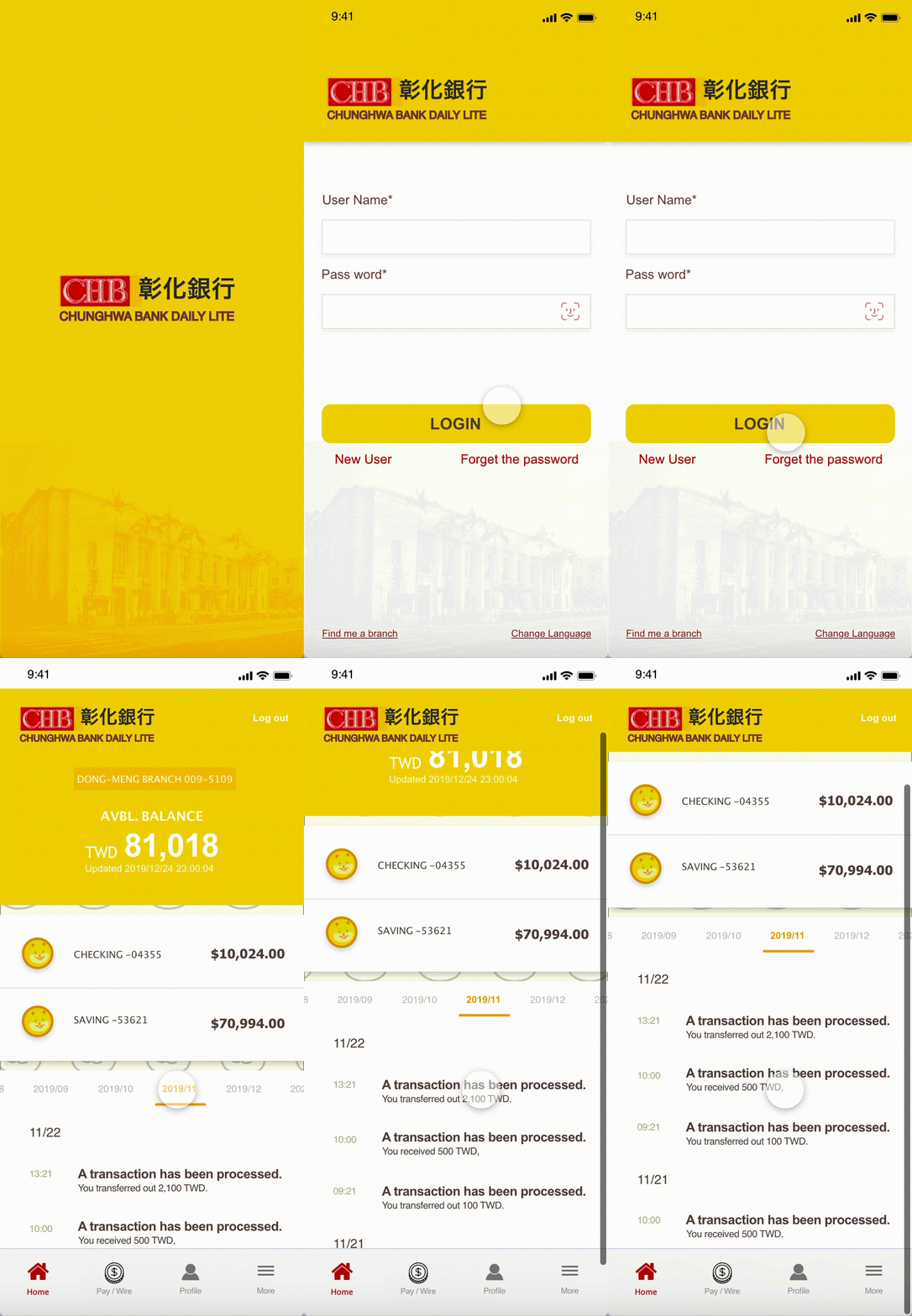
The login screen is designed to be neat and clear. Compare to the original design and the wireframe, detracting elements have been removed from the screen. Instead of worrying about forgetting the password, users can use FaceID or fingerprint to log in their accounts.


The original screen, my wireframe, and the redesign
BILL PAYMENT
In the bill-paying screen, users see a list of services that have a contract with the bank. Later, they go through the process to get their bill information -- differed by the services. Or they can use the barcode on their paper bills.
There is no specific area of bill payment in the original CHB app, users have to read the main and only side-navigation menu and search the merchant by themselves.
WIRE
Based on the survey, the wiring function is the most important feature in this project. Since the way PayPal and Venmo transfer money is still illegal in Taiwan, transfer money with ATM or banking app is the most common method to pay a friend or individual merchants.
Transferring money by wiring requiring a lot of information input, the design is dedicated to taking off the cognitive burden from users. Even in the wireframe stages, I put too many elements at the same pages. After multiple times of iterations, I eventually came out with the design without distracting elements.


Users can select their bill in a provider list


Users can select their bill in a provider list

Select the payee.


Select the payee.