Design Critique W3
- VVenlin P

- Feb 13, 2019
- 2 min read
Updated: Mar 23, 2020
This critique is linked to concepts in FUNDAMENTAL OF COMPOSITION.
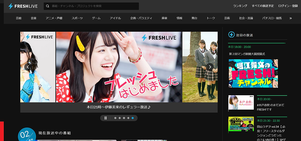
The website I chose to do the critique is a Japanese streaming website names FRESHLIVE. It’s a website which broadcasting the programs they made by their own. The homepage of the website is as below.

There are attributes being discussed in the book: balance, consistency, contrast and proximity. The homepage have a nice consistency. Nearly all the text are white or lighter gray instead of broadcasting times are written in green. The page keep a calm black tone, which is one of the best color that contrasts in white.

Freshlive.tv use a relatively low contrast color to differentiate different area on the page. It’s a little difficult to say where exactly the boarders are, but they place texts (also, are links) in a repeat pattern so that user could use these repetitions to define the content. For example, even though divided by low contrast color difference, it is still easy to see the relationship between links under the head is a group because of the way they aligned. The poster is keeping shuffling, but the incomplete picture in the side and the arrow indicate that there are different content and the user could view the content they want. While browsing the different poster the little bar follow the direction of page turning and give hint of where do the relationship of the “location” of the posters. The first part of the main box doesn’t not end at the same horizontal line, which makes it clear that the page has more content and need to be scroll down.

Especially while the real ad looks like that
The one thing I want to give out my critique is the channel lists on the right side. The first, bigger channel with a big “FRESH” in the center of their thumbnail looks like an ad and would probably being ignored by users ( in contrast of what the website want to do with the channel.) A consistency problem shows here, it doesn’t follow the pattern other channels share: Thumbnail at left, green time information as division and some detail information under the time information. It is the first content of the right sidebar, but the align of it is not well-designed. Lack of consistency, also the unclear relationship of time, thumbnail and detail make users confused about it and probably would decide to leave it alone. Another reason of this problem is that the website decide not to use contrast color to light up the division, which makes the grouping task highly rely on repetition and symbols.
I did my version of the home page with slight design changing. It could be more delicate than this. I agree that to be an eye-catcher the thumbnail of the focus channel still should be bigger than the other thumbnails. To keep this contrast, there won’t be enough space displaying the information as the way other channel does. However, by grouping the time information and detail together it still create a level of repetition and pattern easier to read. I also shorten the green line of the first time information and the width of the thumbnail of the first item to keep the balance of the right side bar.


Comments